
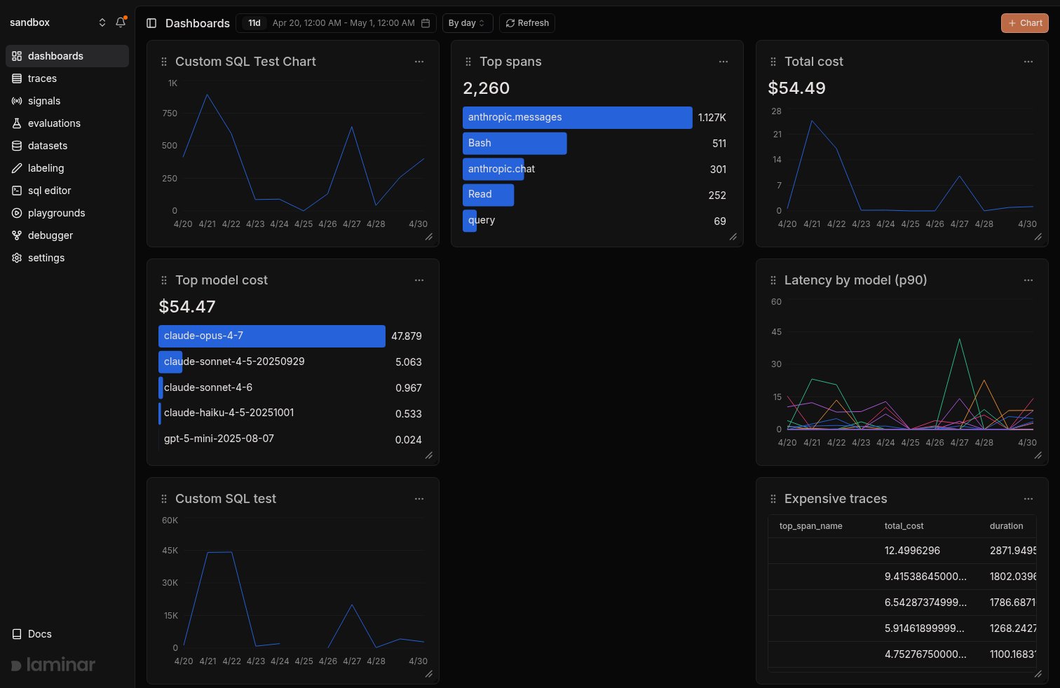
Start from a preset
The+ Chart button opens a preset picker grouped by data source: Traces, Spans, Signals, plus Custom for the blank chart builder. Pick one and you land in the chart editor with the query already shaped; tweak filters, group-bys, or the name before saving.
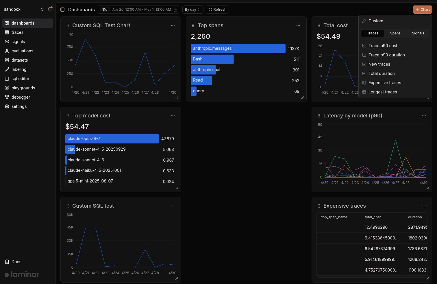
- Traces: Trace p90 cost, Trace p90 duration, New traces, Total duration, Expensive traces, Longest traces.
- Spans: Total cost, Total tokens, Tokens by model, Top span names, Expensive spans, Longest spans.
- Signals: Signal events, Signal events table.
Chart types
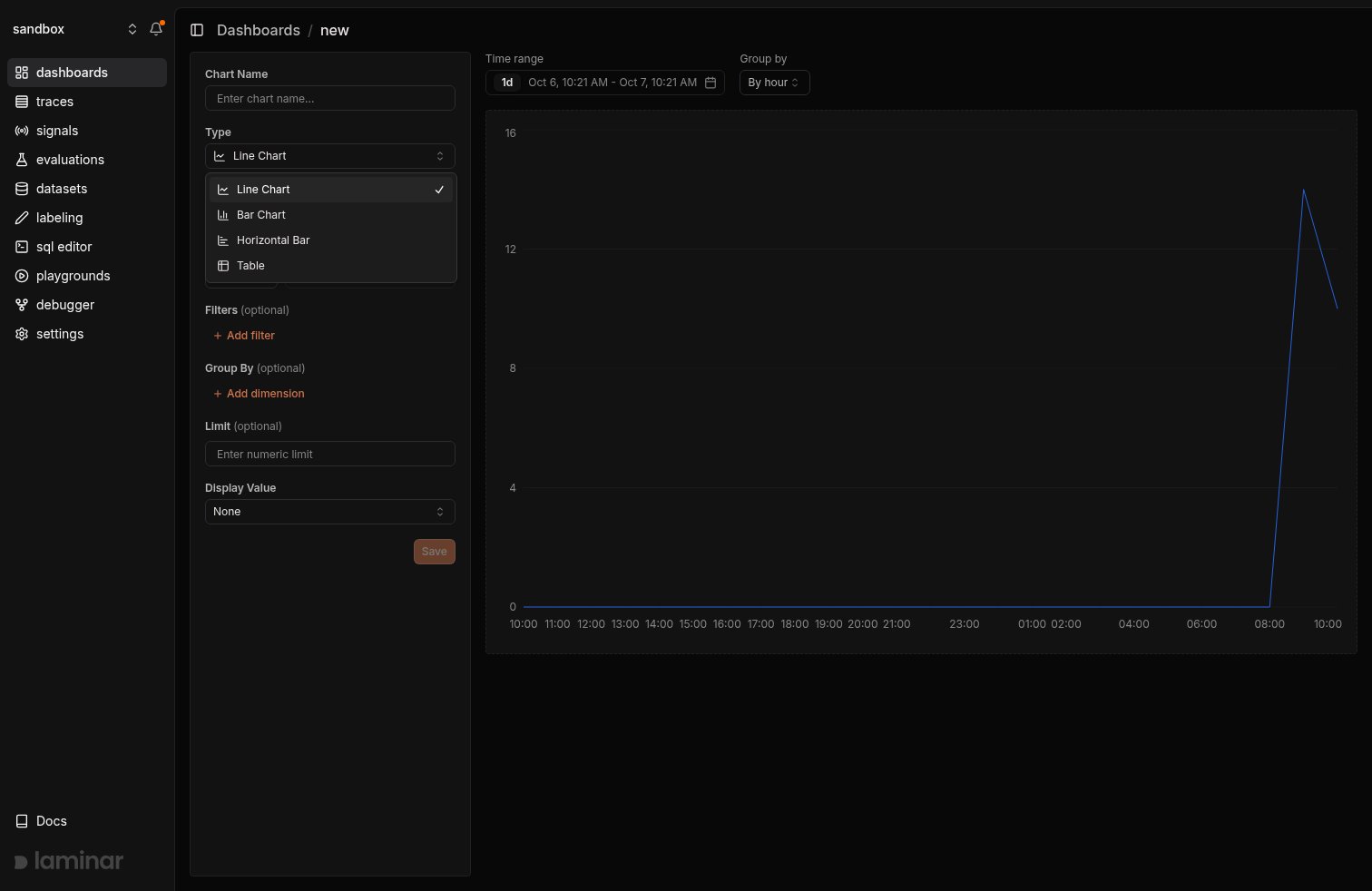
- Line Chart: time series. Data is grouped by an interval that auto-adjusts to the selected time range.
- Bar Chart: time series as vertical bars. Useful when you want to emphasize individual buckets.
- Horizontal Bar: ranked comparisons. Clicking a bar opens the underlying trace or span in a side panel.
- Table: a SQL-backed data dump with sortable columns, infinite scroll, and column order, width, and visibility that persist on the chart. Rows render an inline link in the
trace_idoridcolumn that opens the trace.
Click and drag to narrow a time range
Drag across any time-series chart to highlight a range. The same range overlays every other chart on the dashboard via a shared sync, so you can see the selection land across every panel at once.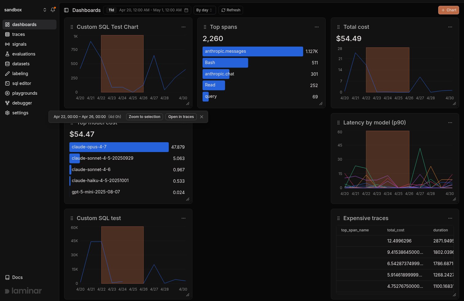
- Zoom to selection rewrites the dashboard’s
startDateandendDateso every chart re-queries against the narrower window. - Open in traces opens the Traces page in a new tab, pre-filtered to the same window.
Open a trace from a chart
Horizontal bar rows and table rows are clickable. Clicking a bar or anid or trace_id cell opens the trace in a side panel so you can jump from a metric straight to the run that produced it, with no need to copy an ID into the Traces page.
This works because the chart editor auto-injects the relevant id column into the query when you pick a table that has one (traces, spans, signal_events). The injected column is hidden from the chart’s visual output but carries through to the click handler.
Building a chart
To create a chart from scratch, click+ Chart and choose Custom.
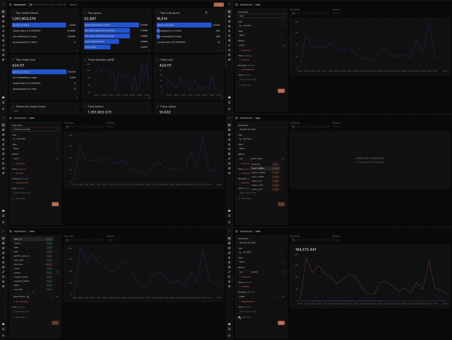
- Type: line, bar, horizontal bar, or table (see above).
- Table:
traces,spans, orsignal_events. - Metric: one of
count,sum,avg,min,max,p90,p95,p99on a column, or Custom SQL for an arbitrary expression (covered below). Tables use a column picker instead of a metric. - Filters: narrow rows before aggregation.
- Group By: break the metric down by a dimension (e.g.
model,provider,span_type). - Order By and Limit: relevant to horizontal bar and table.
- Display Value: covered below.
Custom SQL metrics
If the built-in aggregations don’t cover what you need, pick Custom SQL from the metric dropdown. The column picker is replaced by a small SQL editor with schema-aware autocomplete for the selected table. Whatever you type is inserted as the<expr> in:
countIf(status = 'ERROR'), avg(total_tokens), quantile(0.95)(duration)) or any ClickHouse expression that returns one value per group. Group-by dimensions and filters are applied by the rest of the chart builder around your expression, so you don’t need a GROUP BY or WHERE clause inside it.
A few patterns that come up often:
- Conditional counts:
countIf(span_type = 'LLM' AND status = 'ERROR')to count only error LLM spans. - Ratios:
countIf(status = 'ERROR') / count() * 100to chart an error rate as a percentage. - Custom percentiles:
quantile(0.75)(duration)when the built-in p90/p95/p99 aren’t the cut you want. - Expressions over multiple columns:
sum(input_cost + output_cost).
traces, spans, signal_events, evaluation_datapoints, etc.) and their columns, see the SQL editor table schemas reference.
Custom columns on tables
Tables don’t aggregate, so instead of a metric they take a list of columns. Each row is either a column from the table or, via the Custom SQL option in the same dropdown, an arbitrary SQL expression evaluated per row. Custom columns are useful when the column you want doesn’t exist as-is on the table:- Combine fields:
concat(name, ' (', model, ')'). - Pull a value out of a JSON attribute:
JSONExtractString(attributes, 'gen_ai.request.model'). - Compute a derived value:
total_tokens / durationfor tokens per second per span. - Format a value:
formatReadableSize(input_tokens).
column_ab12cd) so reordering or removing other columns doesn’t rename it. Rename it by editing the chart’s column list.
The same schema autocomplete and table reference apply: see the SQL editor table schemas reference for what’s queryable on each table.
Display Value
Line and bar charts can render a headline number above the plot: the total across the visible window, the average across buckets, or nothing.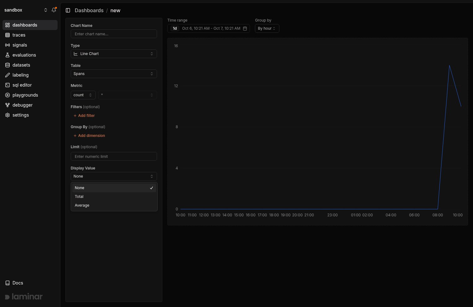
$ prefix, duration columns render with a seconds suffix, everything else renders as a plain number.
Examples
Total tokens by model
See which models consume the most tokens, and how that breakdown shifts over time.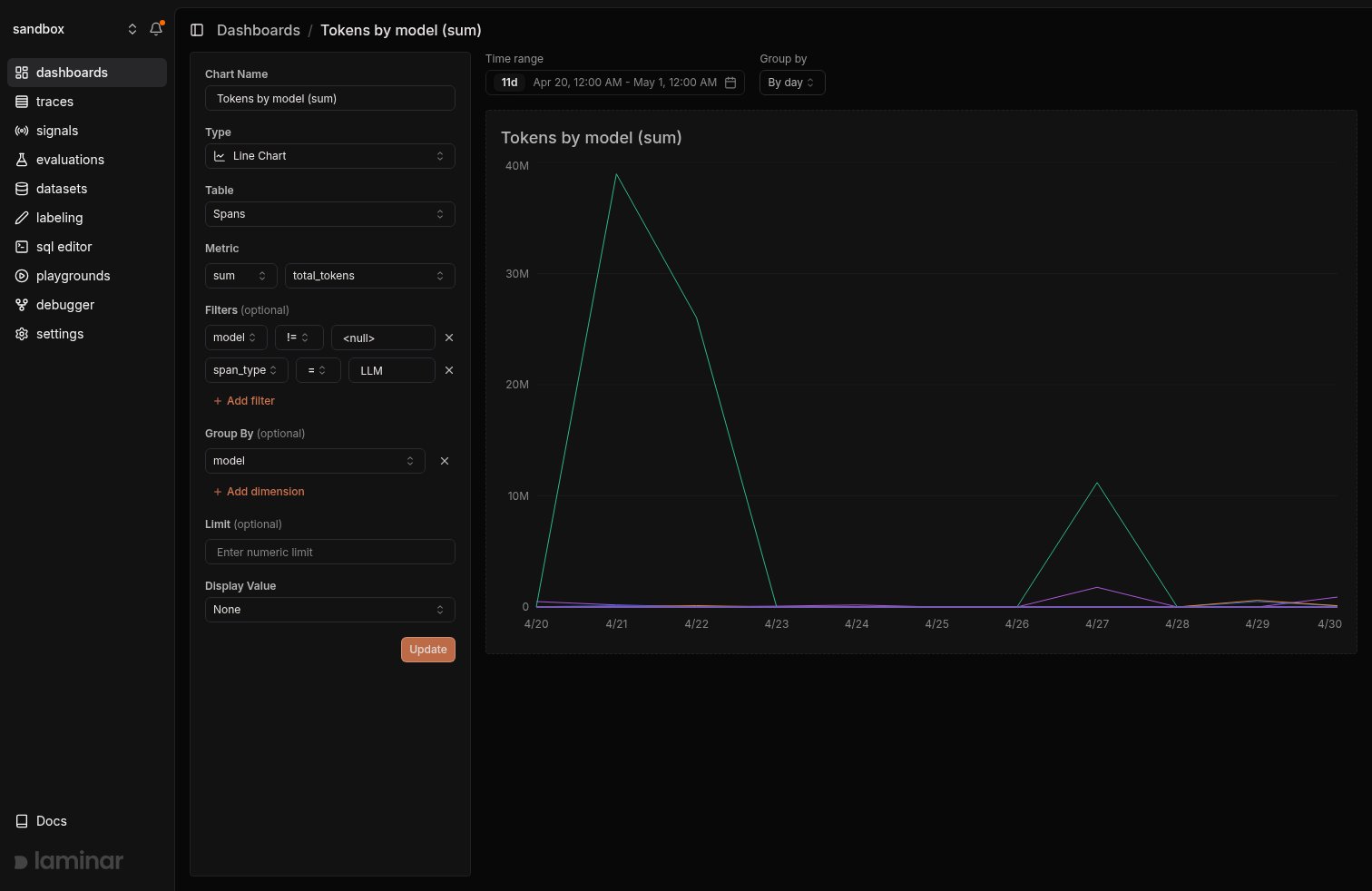
- Type: Line Chart
- Table:
spans - Metric:
total_tokenswithsum - Group By:
model - Filter:
span_type = LLM
p90 cost by provider
Track what your p90 (the cost of your more expensive requests) looks like across providers, so you can spot cost regressions early.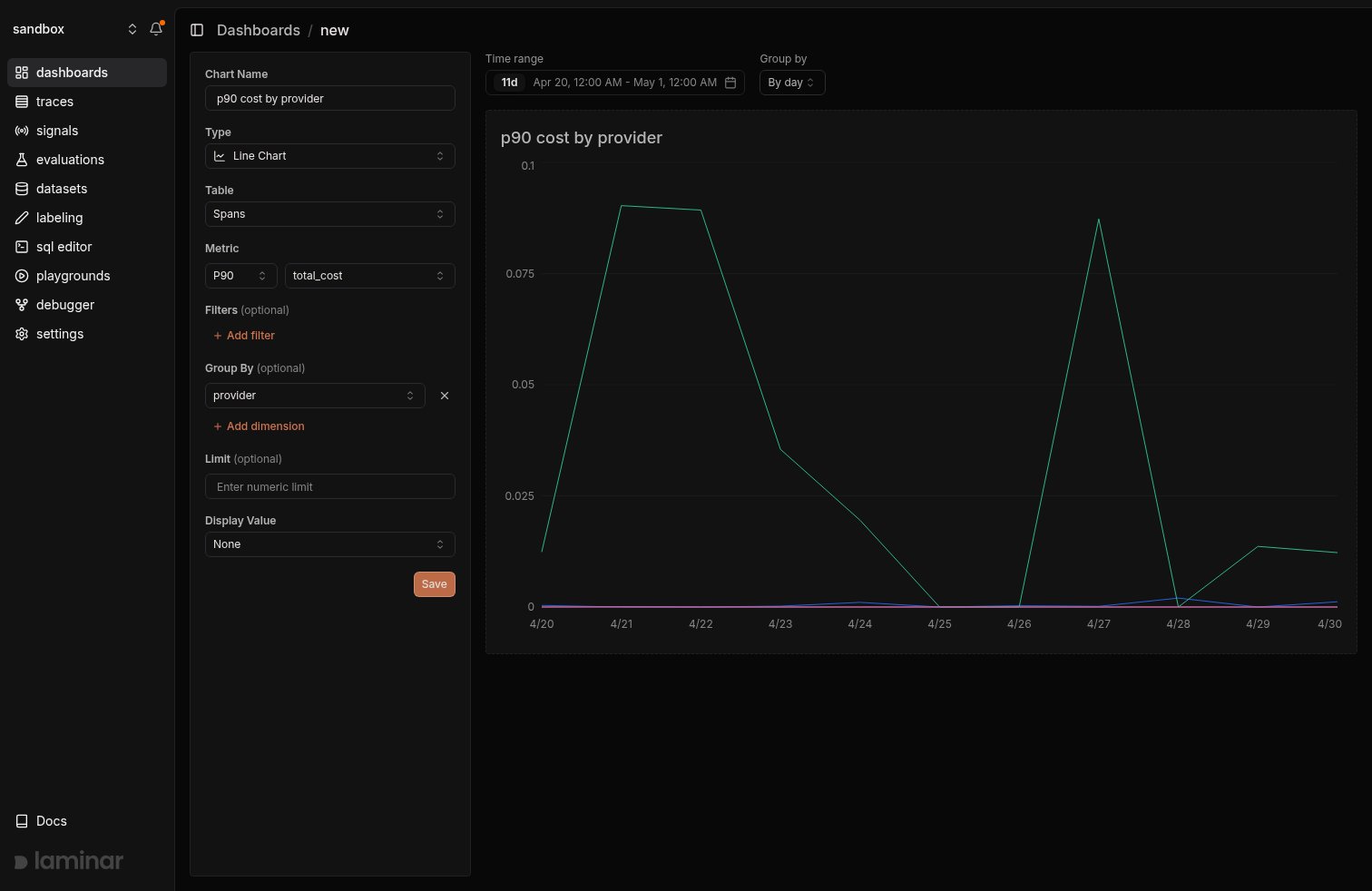
- Type: Line Chart
- Table:
spans - Metric:
costwithp90 - Group By:
provider